-
Your shopping cart is empty!
What makes our formatting in particular so unique? If you care about your reader’s experience, you might want to hire a professional formatting service. While FED is a tad on the pricier side, here are 10 reasons that will make this investment totally worth it.
Don’t underestimate the importance of images in ebooks.
Transparent images: A lot of people, myself included, like to read their ebooks on various backgrounds, depending on the time of day. I find white a little straining on the eyes late at night, so I switch my background to sepia for a softer display. This brings out an ugly fault in embedded images.
![]()
![]()
While you think that your images are transparent, they’re not. The way to test fleurons’ transparency is by changing your ebook’s background color from white to sepia or blue. You’ll notice the image is in a white square like a regular JPG. The problem is that Kindle doesn’t understand .PNGs either. It will still display the transparency inside a white box.
Well, good news to all of you schticklers out there, who like me, are bothered by the white blotches in images. FED has found a way to make your reader acknowledge transparency.
Responsive images: Sometimes if your eyes are a little tired and you decide to enlarge the font while reading or in other words, zooming in, another annoying feature is instantly exposed. The images won’t remain in the correct proportion relative to the text. You’ll find that the images would either become too tiny or would eat up an entire page.
No software involved.
No Calibre, no Sigil, no Jutoh, InDesign… nothing: Making ebooks is very much like creating a basic HTML website. But we decided to bring in a little bit more advanced features from our coding experience and take it up a notch.
When you use software (which I understand to some that’s the only option) it will leave a secret signature in your ebook. These are things that we usually rip apart whenever we download an ebook. We can look at the guts of ebooks and find out everything that’s been done to it, what software, and everything else.
Instead, we work from scratch. We take your book’s content and cleanly lay it out in the right amount of code. This guarantees that your book will be set apart in terms of quality and experience.
Serialization: We’ve found that most software don’t register book serialization into the meta. Even if you fill in the information in the front end of the software, somehow it doesn’t file your books together once it goes live on various platforms. We can make that happen (only ePub currently).
The new ePub 3 standard has built-in support for collections and series, ePub 2 can be made to work but it depends on the device/reader if it'll display. Mantano Reader for Android supports it for instance.
No fuss additions that add class and quality to your product. (add-ons are charged separately)
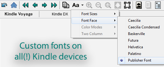
Custom (legal) fonts: I’ve come across a lot of indie authors who honestly didn’t know that Windows fonts are copyrighted. Just because the fonts came ‘free’ with the OS, doesn’t mean you are licensed to use them. Publishing is not considered personal use but commercial use. Some software like InDesign, for instance, won’t allow you to embed illegal fonts. To avoid this issue, you must buy the appropriate license or download a free for commercial use font. However, if FED is doing the formatting, you won’t need to do anything other than name (never send) your favorite font if you have one or just count on us to find the right font for you.
Another scary trap is when you embed a font and make it available for extraction. You would inadvertently become an illegal distributor of the font via ePub. Another issue that could be solved sans software.
So now that legalities are out of the way, we’ve also noticed that choosing an appropriate font that is easy to read and would enhance the user experience also presented a challenge to some. As a graphic design and font creator, you can certainly count on FED’s experience with font choice both for electronic and print publication.
Drop Cap: This is definitely an add-on and not a necessity. I personally love the look of a drop cap in the beginning of every chapter so I’ve included them in my own work. Creating this feature using any regular software usually doesn’t translate well and will show up all mangled in some places. We can integrate clean, steady, and responsive drop caps.
Definite stand-outs in overall quality and reader’s experience.
Quicker loading: There’s a difference between loading a bulky 10MB file and a light couple of MBs. Using formatting software as well as adding images that have not been properly sized (and by that I don’t just mean dimensions) will bulk up your product and make it slow. It can also incur more sales/delivery costs on you. What if your book was mainly composed of images, illustrations, and a variety of fonts? No fear, we can make sure your ebook is most efficient.
Besides large images slowing down the loading of your pages, lean coding also makes a difference. When you examine a generated ebook it’s very common to find dozens of CSS classes that could be simplified significantly.
Most software creates a standard stylesheet with lots of classes the ebook doesn’t even use. Jutoh and Calibre create classes if you manually change something to italic, for instance. This should be a single class for *all* italics in the entire book.
The following example is from a standard Jutoh stylesheet:
.P_Normal {
font-family: "Times New Roman",serif;
font-size: 1.00em;
text-align: justify;
margin-top: 0.00em;
margin-bottom: 0.80em;
margin-left: 0.00em;
margin-right: 0.00em;
text-indent: 0.00em;
}
.P_Body_Text {
font-family: "Times New Roman",serif;
font-size: 1.00em;
text-align: justify;
margin-top: 0.00em;
margin-bottom: 0.40em;
margin-left: 0.00em;
margin-right: 0.00em;
text-indent: 0.00em;
}
.P_Body_Text_First_Indent {
font-family: "Times New Roman",serif;
font-size: 1.00em;
text-align: justify;
margin-top: 0.00em;
margin-bottom: 0.40em;
margin-left: 0.00em;
margin-right: 0.00em;
text-indent: 1.20em;
}
And could be simplified as:
p{
font-family: "Times New Roman",serif;
font-size: 1.00em;
text-align: justify;
margin: 0 0.8em 0 0;
text-indent: 0;
}
.body-text{
margin-bottom: 0.40em;
}
.indent{
text-indent: 1.20em;
}
<p class=”indent”>Some text...</p> This would take the style from the p tag and just add the indentation. Less code, way easier to write and definately faster to execute, let alone the smaller filesize for the css file.
All special characters. (quotes, en-dash, elipses…):
By using the code equivalent of special characters such as n/m-dashes, ellipsis, curly quotes as opposed to straight quotes, copyright symbol, accents for certain languages like French...we make sure that every possible device that reads HTML in the world, from Windows 3.1 up to CentOS 7 and what not would *know* how to draw the correct character.
Proper double-indent: For characters reading text or stories within stories, this format has proven to be most effective in traditional paperback. However, most people find it hard to apply into electronic publication without losing something in the process. I’ve heard that most formats (ePub/mobi) won’t handle double-indents as intended. Not if FED’s doing the job. Stability is key and we made sure this is a viable option for anyone who needs the double-indent.
Word wrap that keeps entities together:
Some combination of words and items should be kept connected on the same line.
For instance title of person (Dr. Roberts), date (Februari 18th), names (A. J. Coffeedrinker Jr.) - King Louie III, comma separated values
We haven't seen this option in any software but it's easy using html entities.
eBook Formatting Price: